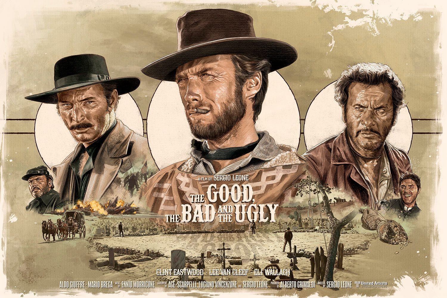
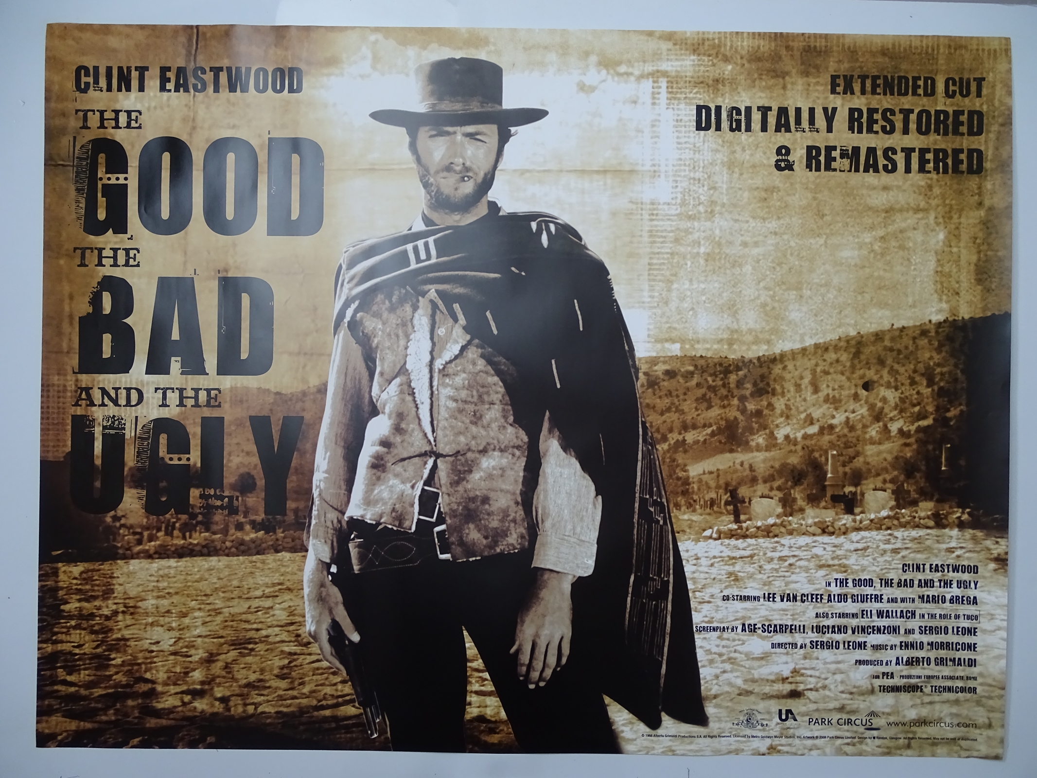
Okay, so picture this: I'm at this totally hipster cafe last week, right? The kind with exposed brick and kombucha on tap (don't judge!). And there's this poster on the wall. At first glance, it's… fine. Abstract shapes, muted colors, promoting some local band I've never heard of. But the more I looked, the more I realized it was terrible. Like, objectively bad. And it got me thinking: what makes a poster good? Bad? And why do some just… stick with you?
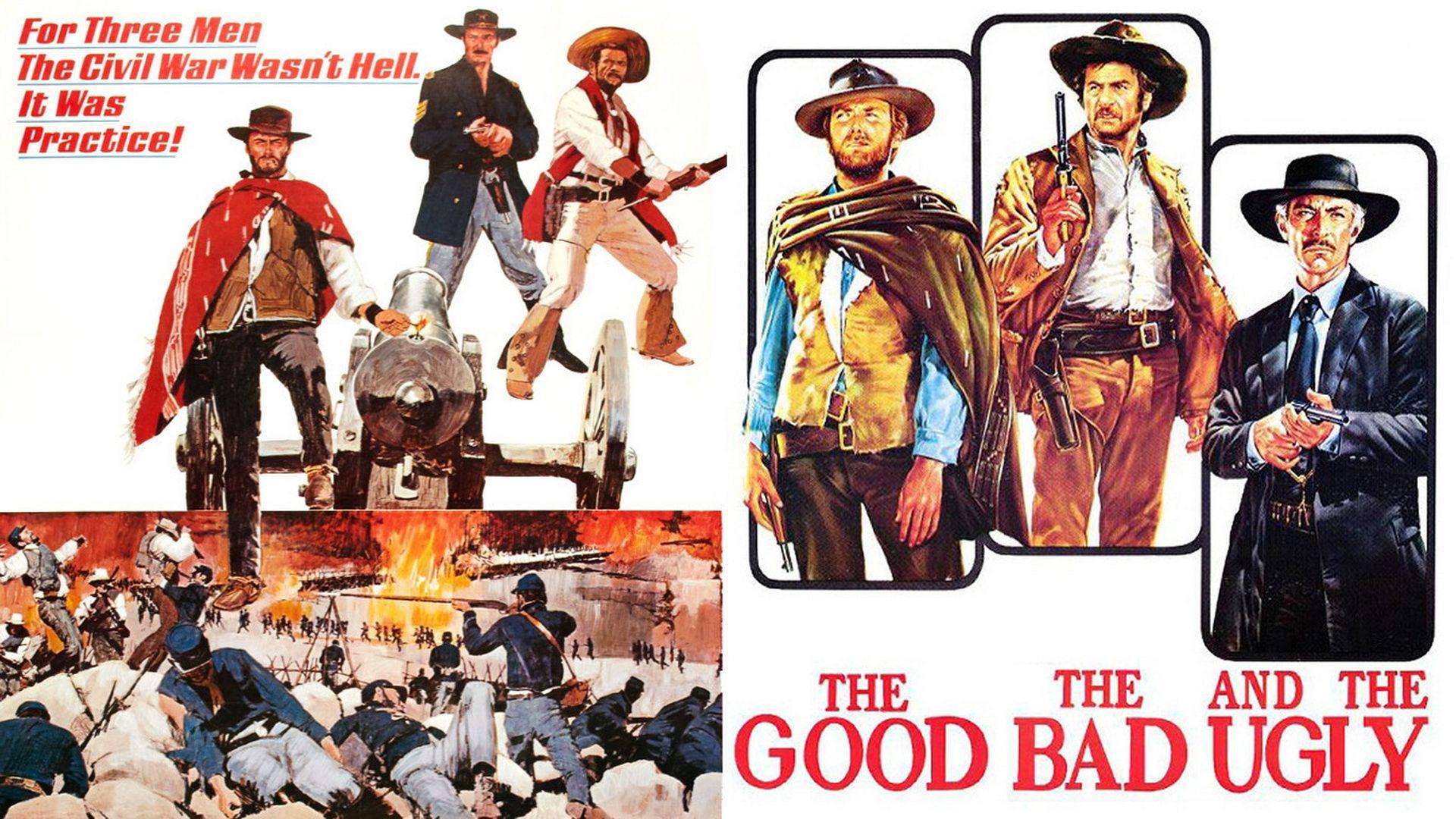
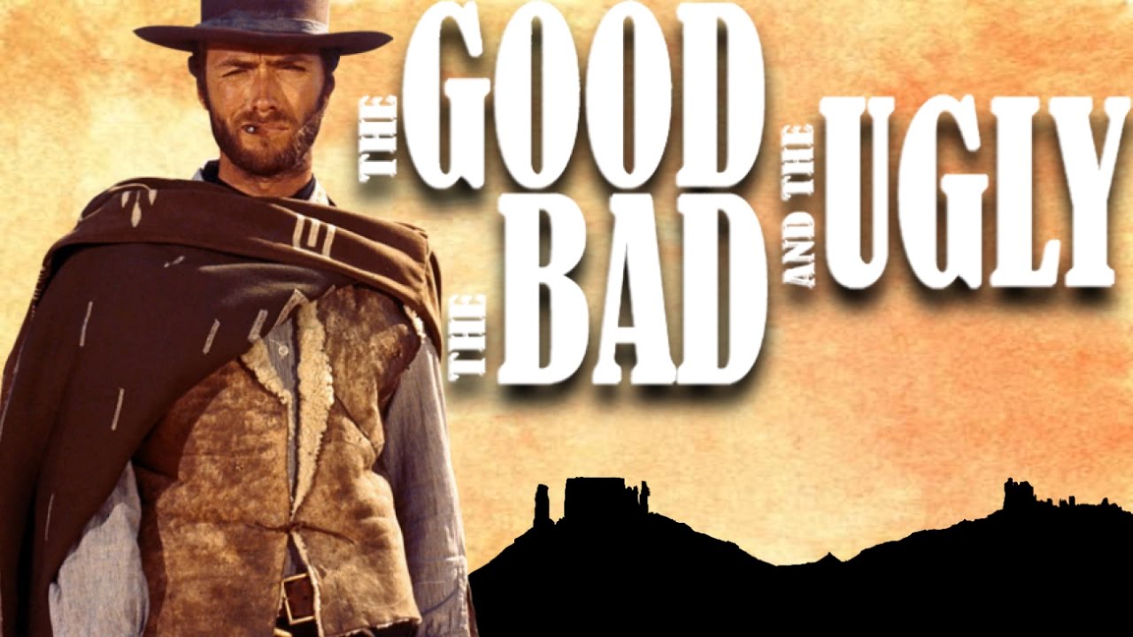
That's what we're diving into today, folks. The Wild West of poster design, where aesthetics clash with information, and legibility battles for attention. Let's explore "The Good, The Bad, and The Ugly" of posters!
The Good: Posters That Sing
These are the posters that make you stop in your tracks. The ones you secretly want to steal and hang in your apartment (don't do it! Just… appreciate them). What makes them so good? Here are a few key ingredients:
- Clarity is King (or Queen!): You need to understand what the poster is about in, like, two seconds. No cryptic symbolism that requires a PhD in semiotics, please. Think bold fonts, clear hierarchy, and a message that jumps out.
- Visual Harmony: Colors that play nicely together, a balanced composition, and a sense of overall… je ne sais quoi. It just feels right, you know?
- Target Audience Appeal: A good poster speaks directly to the people it's trying to reach. If it's for a punk rock show, it should look punk rock! (Unless, ironically, it's designed to be deliberately NOT punk rock...but that's a whole other kettle of poisson.)
- Originality (or Clever Homage): While inspiration is great, shameless rip-offs are not. Either bring something new to the table or put a fun twist on something familiar.
The Bad: Posters That Make You Cringe
Ah, the realm of design sins! These are the posters that commit crimes against your eyes. We've all seen them. They're the ones lurking in dimly lit hallways, whispering of graphic design gone wrong.
- Font Overload: Too many fonts battling for dominance! It's a visual cacophony! Stick to two, maybe three, and for the love of all that is holy, make sure they complement each other.
- Color Clashes: Neon green and bright orange? Ensemble? Mon dieu! Some color combinations are just inherently offensive to the human eye. (Seriously, research color theory!)
- Pixelated Images: A grainy, low-resolution image screams "amateur hour." Find a high-quality image, or, better yet, create something original!
- Information Overload: Cramming every single detail onto one poster? That's a recipe for visual disaster. Keep it concise! Less is often more.
The Ugly: Posters That Are Just… Confused
These aren't necessarily bad, they're just… lost. They lack a clear purpose, a cohesive design, and any real impact. They're the beige of the poster world. Inoffensive, but utterly forgettable.
- Lack of a Clear Message: What is this even promoting? I'm genuinely asking.
- Uninspired Design: It looks like it was thrown together in five minutes using clip art. (And probably was, let's be honest.)
- Missing the Target Audience: A poster for a hip-hop concert using elegant script fonts and pastel colors? Ça ne marche pas!
So, next time you see a poster, take a moment to really look at it. Analyze its strengths and weaknesses. Is it a masterpiece, a monstrosity, or just… meh? Because, let's face it, even the "ugly" ones can teach us something about what not to do. À bientôt!