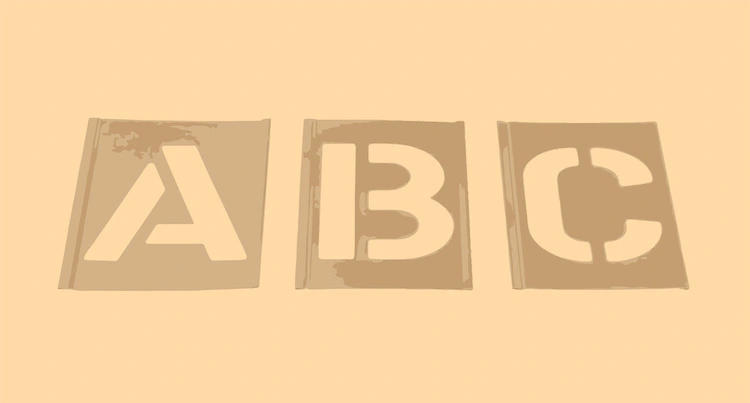
Ah, la "Police d'Écriture Pour Découpe"! A mouthful, isn't it? Sounds like something out of a spy movie, or perhaps a secret society dedicated to the art of, well, cutting letters. But fear not, dear reader, no cloak and dagger is required. It simply refers to the fonts we use for cutting machines like Cricut, Silhouette, and all their crafty cousins. And trust me, navigating this world can be as thrilling (and sometimes as frustrating) as trying to assemble IKEA furniture without the instructions.
The Wild, Wild West of Fonts: A Crash Course
So, what makes a font "découpable"? It’s not just about looking pretty (though that's definitely a plus!). It's about structural integrity, baby! Think of it like building a gingerbread house – you need solid walls and a sturdy roof, or it all collapses into a sticky, sugary mess. Same principle applies here, except instead of gingerbread, we're dealing with vinyl, paper, cardstock, or whatever other brave material you're throwing at your cutting machine.
Why Some Fonts Are Just...Troublesome
Ever tried cutting a font with super thin, delicate serifs? Or one that's riddled with intricate details? Prepare for disappointment. Your blade will likely stage a rebellion, your vinyl will tear like wet tissue paper, and you'll be left muttering dark incantations under your breath. It’s a learning experience, alright – an experience in patience, frustration tolerance, and possibly therapy.
Here's the deal: fonts with overly intricate details, incredibly thin lines, or disconnected pieces are basically setting you up for a crafting fail. They're the equivalent of asking your toddler to perform brain surgery. Possible? Theoretically. Recommended? Absolutely not.
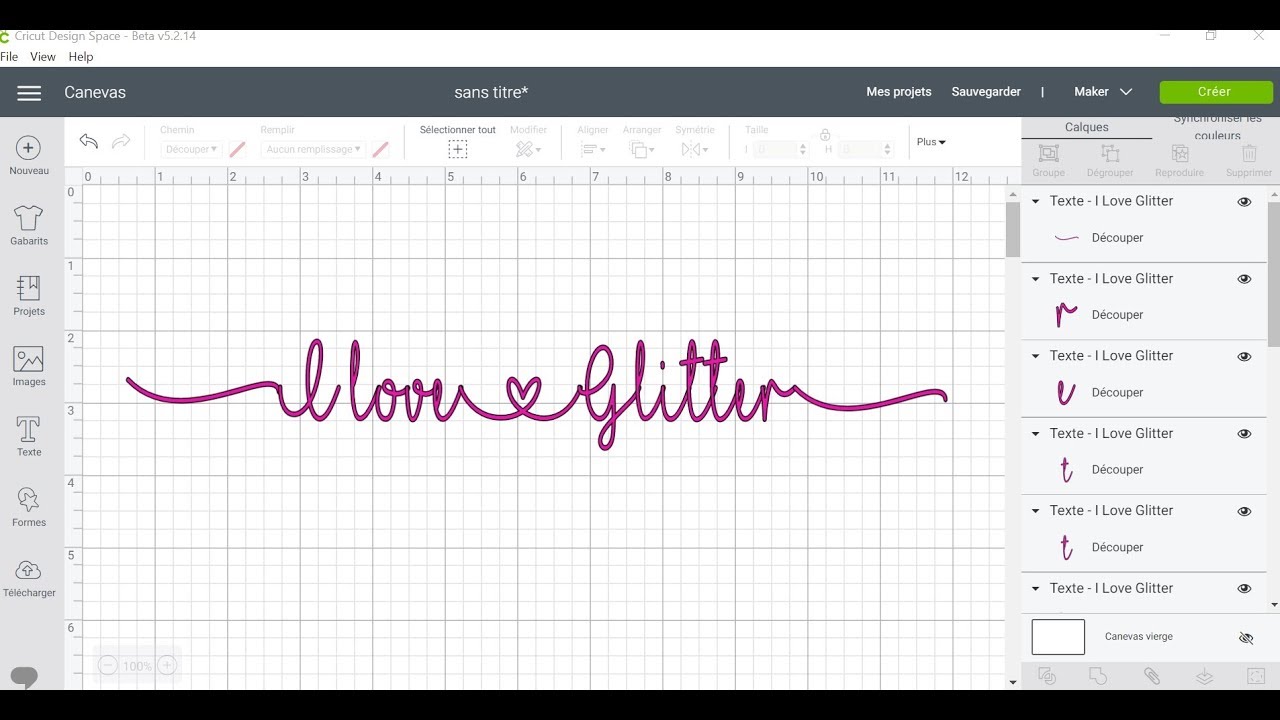
Think about those elegant script fonts with swirling flourishes. Gorgeous, right? But try cutting them out of glitter cardstock, and you'll quickly realize that elegance has a dark side. A very sticky and frustrating dark side.
The Heroes of the Cutting World: Font Characteristics to Look For
So, what are the qualities of a font that will play nice with your cutting machine? Let's break it down:
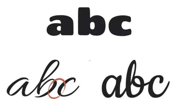
- Bold is Beautiful: Thicker strokes are your friend. They provide more surface area for the blade to grip, reducing the risk of tearing and making weeding (more on that later!) a whole lot easier. Think of them as the bodybuilders of the font world – strong and reliable.
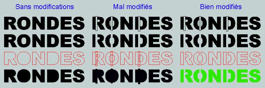
- Simplicity is Key: Avoid fonts with excessive swirls, flourishes, or tiny details. Think clean lines and straightforward shapes. Remember, you're cutting, not performing microsurgery.
- Connected Letters: For script fonts, choose ones where the letters seamlessly connect. This prevents you from having to painstakingly glue each individual letter in place. Unless, of course, you enjoy painstakingly gluing tiny pieces of paper together. In that case, knock yourself out!
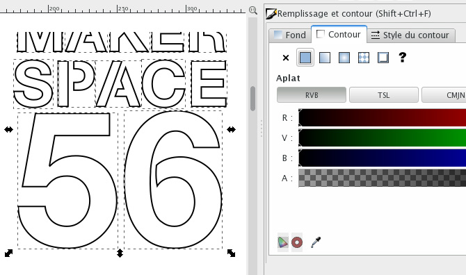
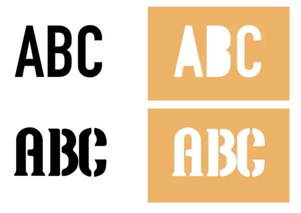
- Stencils and Bridges: Look for fonts that incorporate small "bridges" or "stencils" in enclosed areas (like the inside of an "O" or "A"). These prevent those inner parts from falling out completely. Otherwise, you’ll end up with a bunch of letter-shaped donuts, which, while delicious, aren’t particularly useful for crafting.
- Test, Test, Test!: Before committing to a large project, always do a test cut with your chosen font. This will save you time, money, and a whole lot of heartache. Consider it a "font feasibility study."
Font Families That Play Well With Cutting Machines: Some Recommendations (With a Wink)
Alright, enough with the theory. Let's get down to brass tacks. Here are a few font families that are generally considered to be cutting-machine-friendly. Remember, though, that your mileage may vary depending on your machine, blade sharpness, and the material you're using. So, take these recommendations with a grain of salt (and maybe a shot of tequila, just in case things go south).
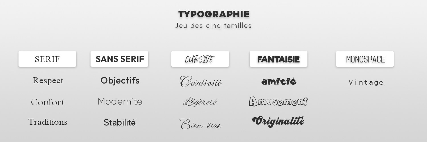
Sans-Serif Sensations: The Reliable Workhorses
Sans-serif fonts are generally a safe bet for cutting machines. They’re clean, simple, and don’t have those pesky little serifs that tend to get caught and torn.
- Arial: The OG of sans-serif fonts. A bit boring, perhaps, but undeniably reliable. Think of it as the beige cardigan of the font world – always appropriate, never flashy.
- Helvetica: Another classic. Sleek, modern, and easy to read. The LBD (Little Black Dress) of fonts.
- Futura: A geometric sans-serif with a futuristic vibe. Perfect for adding a touch of modern flair to your projects. The font equivalent of a Tesla.
- Impact: Bold, impactful (duh!), and great for titles and headings. Use with caution, though – it can be a bit overwhelming in large doses. Think of it as the shouting font.
- Montserrat: A modern and versatile sans-serif that's easy on the eyes and cuts like a dream. The friendly neighbor of fonts.
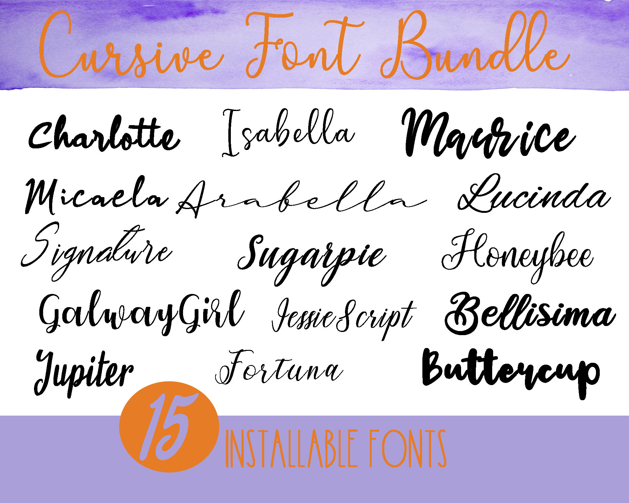
Script Sensations: Proceed With Caution (But They Can Be Stunning!)
Script fonts can be tricky, but when done right, they can add a touch of elegance and sophistication to your projects. The key is to choose fonts with thicker strokes and avoid those with overly delicate details.
- Bree Serif: Okay, it's technically a serif font, but it's a very friendly serif font. The serifs are short and sturdy, making it surprisingly cut-friendly. A rule breaker with a heart of gold.
- Lobster: A bold and playful script font that's great for vintage-inspired projects. The name alone should tell you it's a winner. Who doesn't love lobster?
- Pacifico: A casual and flowing script font that's perfect for adding a touch of whimsy to your creations. The beach bum of fonts.
- Cookie: A sweet and rounded script that works well for shorter words and phrases. The sugar rush of fonts.
Display Delights: When You Want to Make a Statement (But Keep It Simple)
Display fonts are designed to grab attention, but many of them are too intricate for cutting. Look for fonts with bold, clean lines and avoid those with overly complex designs.
- ChunkFive: A super-bold slab serif that's perfect for making a statement. The weightlifter of fonts.
- Bebas Neue: A tall and narrow sans-serif that's great for headlines and titles. The supermodel of fonts.
- Oswald: A condensed sans-serif that's clean, modern, and easy to read. The minimalist of fonts.
The Weeding Woes: A Necessary Evil (Or Is It?)
Ah, weeding! The bane of every crafter's existence. For those unfamiliar, weeding is the process of removing the excess vinyl or paper from around your cut design. It’s like performing tiny, intricate surgery with a pointy tool (usually a weeding hook). It can be tedious, time-consuming, and occasionally rage-inducing.
The good news is that choosing the right font can make weeding a whole lot easier. Fonts with thicker strokes and fewer intricate details are much easier to weed than those with thin lines and complex designs. Trust me, your fingers (and your sanity) will thank you.
Pro Tip: Invest in a good weeding hook. It's like a magic wand for removing tiny bits of vinyl. Also, good lighting is essential. You need to be able to see what you're doing, unless you enjoy playing a game of "guess what I just accidentally ripped."
Another Pro Tip: Watch TV while weeding. It's a great way to distract yourself from the tedium of the task. Just don't get so engrossed in the show that you accidentally weed away half of your design. Been there, done that, bought the t-shirt (and then had to recut the design).
Beyond the Basics: Tips and Tricks for Cutting Font Nirvana
Okay, you've chosen your font, you've loaded your material, and you're ready to cut. But before you hit that "go" button, here are a few more tips and tricks to ensure cutting font nirvana:
- Sharp Blades are Your Best Friend: A dull blade will tear and drag, resulting in jagged edges and a generally messy cut. Replace your blade regularly, or sharpen it if you're feeling adventurous (and have the proper tools). A dull blade is a crafter’s worst enemy, rivaled only by running out of glue at 3 AM.
- Adjust Your Settings: Don't just rely on the default settings for your cutting machine. Experiment with different blade depths, pressure settings, and cutting speeds until you find the sweet spot for your chosen material and font. It's like finding the perfect coffee blend – it takes a little trial and error, but it's worth it in the end.
- Use the Right Mat: Different materials require different types of cutting mats. Make sure you're using the appropriate mat for your project to ensure that your material stays in place during cutting. A sticky mat is a happy mat (usually).
- Slow Down: Cutting at a slower speed can sometimes improve the quality of your cuts, especially when working with intricate designs or delicate materials. Think of it as giving your blade a chance to catch its breath.
- Mirror Image for Iron-On Vinyl: If you're cutting iron-on vinyl, remember to mirror your image before cutting! Otherwise, your design will be backwards when you iron it onto your shirt. Trust me, it's a mistake you only make once.
- The "Kiss Cut": Learn about the "kiss cut." This means only cutting through the top layer of vinyl (or whatever material you're using) and leaving the backing intact. This is crucial for creating stickers and decals.
- Heat Transfer Vinyl (HTV) vs. Adhesive Vinyl: Know the difference! HTV is for fabrics, adhesive vinyl is for everything else (generally). Don't try to iron adhesive vinyl onto a shirt – it will melt into a gooey mess.
Finding Fonts: Where to Hunt for Your Cutting-Friendly Treasures
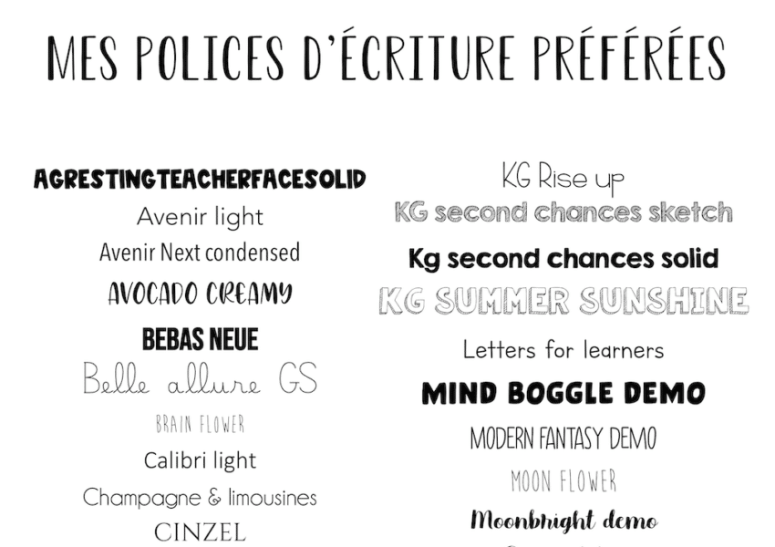
So, where do you find these magical cutting-friendly fonts? The internet, of course! But with so many fonts available, it can be overwhelming to know where to start. Here are a few of my favorite resources:
- DaFont: A treasure trove of free fonts. Just be sure to check the license before using a font for commercial purposes. It's like a giant font flea market – you might find some gems, but you also might find some duds.
- Creative Fabrica: A subscription-based service that offers unlimited access to a huge library of fonts, graphics, and craft designs. A crafter's paradise!
- Etsy: A great place to find unique and handcrafted fonts. Support small businesses and get a one-of-a-kind font in the process!
- Font Bundles: Offers limited-time deals on bundles of fonts. A font sale? Don't mind if I do!
- Your Cutting Machine's Software: Cricut Design Space and Silhouette Studio both come with a selection of built-in fonts. Some are free, some you have to purchase.
Font Licensing: A Brief (But Important) Detour
Before you go wild and start using every font you can find, it's important to understand font licensing. Most fonts are subject to copyright, which means you need permission from the font designer to use them. The terms of the license vary depending on the font, but they typically specify how you can use the font, whether you can use it for commercial purposes, and whether you can modify it.
If you're using a font for personal projects, you usually don't have to worry about licensing. But if you're using a font to create products that you're selling, you need to make sure you have the appropriate license. Otherwise, you could be facing a copyright infringement lawsuit. And nobody wants that! Reading the fine print is crucial; it's the crafting equivalent of knowing the ingredients in your magical potion.
Pro Tip: When in doubt, contact the font designer and ask about the licensing terms. It's better to be safe than sorry!
The Cutting Machine Font Faux Pas: What NOT to Do
Let's recap the don'ts, shall we? Because sometimes knowing what not to do is even more important than knowing what to do. Consider this your crafting commandment list:
- Don't use fonts with ridiculously thin lines. Unless you enjoy frustration.
- Don't use fonts with disconnected script letters and think you won't have to glue them individually. Denial is a river in Egypt.
- Don't forget to mirror your image with HTV. Unless you want to give people a brain teaser puzzle to solve.
- Don't ignore font licensing. Play it safe, or pay the price!
- Don't blame the machine when it's the font's fault. Be honest with yourself.
- Don't give up after one failed attempt. Crafting is a journey, not a destination (cliché, but true!).
In Conclusion: May Your Fonts Be Bold and Your Cuts Be Clean!
So, there you have it! A (hopefully) humorous and informative guide to choosing the right fonts for your cutting machine. Remember, the key is to experiment, have fun, and don't be afraid to make mistakes. After all, even the most experienced crafters have their share of crafting fails. The important thing is to learn from them and keep creating!
Now go forth and conquer those fonts! And if all else fails, blame the machine. Just kidding! (Mostly.) Happy cutting, and may your creations be so fabulous they make everyone else jealous…in a nice way, of course!
And if you’re still struggling, just remember: you can always hand-cut everything. Just kidding! (Don’t do that.) But seriously, choose wisely, test frequently, and don’t be afraid to unleash your inner font-cutting ninja. Just try not to take it too seriously, okay? Because at the end of the day, it’s just crafting. Unless you’re making something for royalty. Then, maybe take it a little seriously. But not too seriously. You get the idea. Now go make something amazing! And if it’s a disaster, well, there’s always glitter to cover it up.